Shades of Gray… you want 50 to inspire passion? Forget about it. I got 256.

Colorful ladies in a world of black and white. The Goddess-Collective
(left to right: Jessica “Harley,” Jillian V, Wonderhussy, and Jessica Dawn)
Facebook.com/GoddessCollective
Before full-color, high-resolution, and the advent of high-definition, there was only black & white [b/w]. Drawings, photography, and movies were all created in black and white. Of course, paintings have been made in color for centuries, but films, partly because that was all the technology was capable of, existed for decades as black and white, and its various shades of gray. And it was great! Of course, I grew up with B/W television and movies, so they are still very dear to me in many ways. I don’t think the Twilight Zone or old Bogart movies would be the same in color. They would lack that particular drama that only happens in shades of gray.
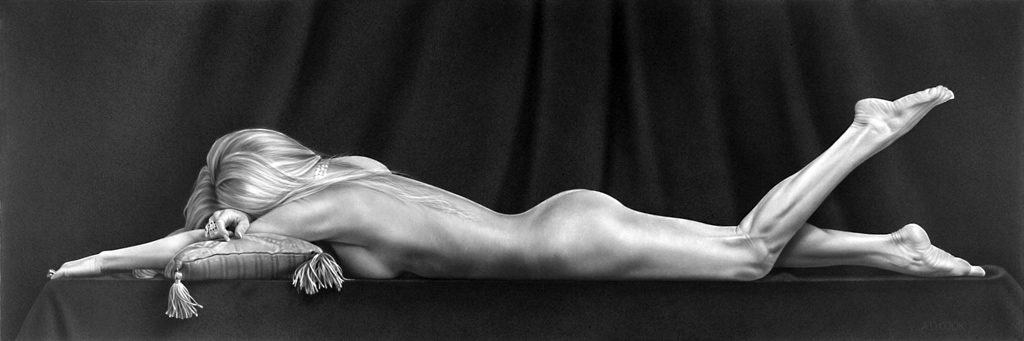
SOLITAIRE – original painting by A.D. Cook – 24″ x 72″, acrylic on canvas
Also dear to my heart is black-and-white/grayscale art. As a young artist, I learned to draw with good old-fashioned #2 pencils on plain white paper. I still love to draw. And I thoroughly enjoy creating black-and-white paintings and the occasional monochromatic artwork. In many ways, I think it leads more to the imagination than full-color creations.
OBLIVIOUS – original painting by A.D. Cook – 24″ x 72″, acrylic on canvas
Creating art in black and white affords a better understanding of the underlying tonal differences that define shape and contour. Like drawing, building layers of pigment produces darker shades of gray.
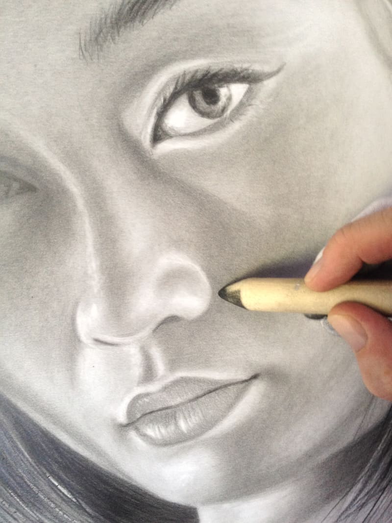
Work in process — pencil drawing in black and white.
Drawing helps improve understanding of tonal ranges. When drawing, like photography, lighter tones appear more forward – hence highlights are in white. Good old-fashioned pencil drawing is still one of the best ways to learn about grayscale tonal values. Artists (and photographers) need to understand the power of tone alone. Centuries ago, artists who also taught, like Leonardo da Vinci, would only allow their students to create monochromatic drawings until the tone was fully understood. Only then were they allowed to explore color.
Naturally, B/W is ideal for fine art photography – especially figurative work. I often convert my color photography with models to B/W images. Everything changes. I find that I tend to crop images differently for black-and-white than for color. Just that mindset of going from color to B/W changes everything in my approach to creating a beautiful image.
B/W is terrific for landscape photography, too, adding drama to a shot.
We’re all familiar with the beautiful photography of American photographer and environmentalist Ansel Adams (1902-1984). His black-and-white landscape photographs of the American West, especially Yosemite National Park, have been widely reproduced on calendars, posters, and books.

Moon and Half Dome by Ansel Adams, 1960
According to an expert source, there are two main reasons why Adams preferred black and white. The first was that he felt color could be distracting and could, therefore, divert an artist’s attention away from achieving his full potential when taking a photograph. Adams claimed he could get “a far greater sense of ‘color’ through a well-planned and executed black-and-white image than [he had] ever achieved with color photography.”
The second reason was that Adams was a “master of control.” He wrote books about technique, developed the “Zone System”—something that helped determine the optimal exposure and development time for a given photograph—and introduced the idea of “previsualization,” which involved the photographer imagining what he wanted his final print to look like before he even took the shot. These concepts and methods enabled nearly complete control over all potential variables that affect a final print. Because of his love for control, Adams disliked color, as it lacked the element he had mastered with black and white. ( source: http://en.wikipedia.org/wiki/Ansel_Adams )
I hope that my work will encourage self expression in others and stimulate the search for beauty and creative excitement in the great world around us.— Ansel Adams

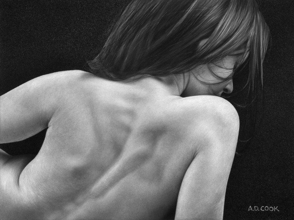
B/W photo of model Jess Robinson by A.D. Cook ©
In the world of printing, “grayscale” refers to the range of tones between BLACK and WHITE. In printing, it’s called halftoning. Grayscale images have many shades of gray in between – 256 in all, including black and white. Grayscale images that are a color variation (like the one below) are also referred to as monochromatic, denoting the presence of only one (mono) color (chrome). The best results come when the maximum range of gray tones, from the deepest shadows to the brightest highlights, is achieved. So, a photo like my shots of Jess (above and below) would ideally have an excellent range of whites, some deep blacks, and a full tonal range.

Monochromatic photo of model Jess Robinson by A.D. Cook ©
When designing my paintings, I often start with one of my photos. Typically, I’ll convert it to B/W and sometimes to various shades of monochrome so I can get an idea of what it feels like in different colors, which can affect the finished work’s feeling. Blues are soothing, reds represent power, and so on. But often (more often than not anyway), I return to pure B/W, especially for my photos.
Here are additional examples of my B/W artworks: CATCHING WIND | AVALON | MARQUEE | INFINITY | ANTHEM | NYX | ROSE | NUANCE | SUBLIME | SOLACE

B/W grayscale – 256 shades from <<- dark to light – >>
• • • • •
In photography and computing, a grayscale digital image is one in which each pixel has a single sample value; that is, it carries only intensity information. Black-and-white images are composed exclusively of shades of gray, ranging from black at the lowest intensity to white at the highest. ( source: http://en.wikipedia.org/wiki/Grayscale )
• • • • •
ARTWORKS | OTHER WORKS | TRUTH & BEAUTY
- About the Author
- Latest Posts
- More info

A.D. is an artist who started drawing at a young age. Throughout his life, he has worked with different creative tools in traditional and digital art and design. His art and writings are showcased in various publications such as Airbrush Action Magazine, Airbrush Magazine, American Art Collector, America’s Sports Car magazine, Art & Beyond, Easyriders, Las Vegas City Life, Las Vegas Weekly, L’Vegue, ModelsMania, Quick Throttle, The Ultimate Airbrush Handbook, America’s Sports Car, The New York Times, and The National Corvette Museum 2024 Annual Report.